Welcome to my portfolio ^_^ This is a record of all my work across my Games, Animation & VFX course (2023-2025)
My LinkedIn: https://www.linkedin.com/in/abby-galloway-3b65b4257/
Welcome to my portfolio ^_^ This is a record of all my work across my Games, Animation & VFX course (2023-2025)
My LinkedIn: https://www.linkedin.com/in/abby-galloway-3b65b4257/
Abby Galloway
Here is my Art Theory In Context essay as a whole, using examples from Fine Art, Games, Animation and VFX. The segments covered in this essay will be as follows:
It is then followed by a references tab, displaying all links used within the essay.
My next post will be an overview and reflection of this essay, you can read it here.
Abby Galloway
Art theory proposes the ideology that no piece of art can establish a certain or particular meaning, though in context, portrays that certain features can support the impact it creates and guide towards a particular perspective. I will be researching and compiling my knowledge, uncovering what elements are used that turn the original ideology in a certain direction purposefully for the conveyance of the artist’s personal depiction. I will then be presenting my observations using examples of each component and the effect it creates within fine art, video games, film and animation. This study will help gather a deeper understanding of the importance of art theory and its pivotal role, whether in an influential or poor manner.
This segment of study will focus on the impression colour can have towards presenting the artist’s intended depiction.

The Death of Germanicus – Nicholas Poussin. (1627)
This particularly influential piece is a very profound advocate on the portrayal of colour’s effects in fine art. The brighter, contesting hues implement the countless powerful themes illustrated, whilst also used to capture the heart of the piece, using the unusually arid depiction of a Roman palace. This usage of colour presents great heroism, and the bittersweet importance of tragedy.

LSD Dream Emulator – Asmik Ace Entertainment. PS1. (1998)
“Lavishly experimental with a real soul of its own” – Person, Chris. (2012)
Stated above is an excerpt regarding this equally notable and uncanny encounter within video games, which is not commonly seen in the present. LSD Dream Emulator’s usage of colour is visibly abstract, this stray from the comfort of normality challenges the psyche, establishing an eerie but immersive encounter. This directly challenges the customary outlook of art criticism indicated by this extract:
“None of us can ever retrieve that innocence before all theory when art knew no need to justify itself, when one did not ask of a work of art what it said because one knew what it did. From now to the end of consciousness, we are stuck with the task of defending art.” – Sontag, Susan. (2009)
I believe it poses such a challenge due to the daring directness of its art even throughout its abstractness; it is what is shown, and should not be questioned.
Parallelism is evident between these two works, both taunting the conventional unwritten rules and understanding of the usage of colour. They are also analogous in such a way that there is not much astray from the heart of the piece; both of these works subtract from the immaterial substance to enhance the spotlight. This handling of colour throughout accentuates the focal point to display the artist’s intent, captivating the viewer into a somewhat hypnotic state of wonder and understanding.
Nonetheless, contradistinction is also distinguishable between both pieces, particularly conveyed throughout the utilised colour variations. Stand-out though conform, the colour composition in The Death of Germanicus is still within uniform, which is undoubtedly differential from that of LSD Dream Emulator, which uses colour to create an unearthly environment.
This analysis will assist my assembly of colour variation and manipulation within future work based on the envisionment I am trying to instil within its audience.
Within art theory, volume is a predominant factor within the manipulation of depth and three-dimensional space of an artist’s work.

Guitar – Pablo Picasso. (1914)
“Picasso’s guitar sculpture is the same size and shape as the real thing, but he shatters its form. If the front of a guitar is a plane concealing a volume, he cuts that plane away, opening up the interior as an empty box.” – D. Lowry, Glenn. (1999)
Seen above is an excerpt which aids with the interpretation of this piece and how its usage of volume is a complimentative and crucial aspect of its presentation. The unconventional display is also sculpted in a way which effectively manipulates light to construct its incredible three-dimensional exhibit.

The Crimson Permanent Assurance – Terry Gillam. (1983)
“Very funny, and very smart, with an ingenious usage of props and natural surroundings.” – Thompson, Bill. (2013)
Within this set, volume is used in a way of which to portray the proportions of each attribute of the scene while also populating the frame in order to achieve this “ingenious” appearance. Depth displayed within both the ship and the pirates presents a form of togetherness, making the audience perceive them as substantially larger and hence more capable than anyone who would happen to cross paths with them.
In terms of correlation, these two insights into volume demonstrate both similarities and differences. A resemblance between these two pieces is evident throughout the use of shape, done to support the conveyance of the three-dimensional environment; shadows are presented in a way that decompiles the piece to effectively depict layers. For instance, distinguishing between background and foreground.
In spite of those correlative aspects, dissimilarities are also apparent. Scientific volume demonstrates this statement. Picasso’s Guitar is unique, it pushes the forms of normality and leaves space for individual interpretation. Inversely, Permanent Assurance brings a conventional form to a unique situation; the director constructed the set to make an impression (the pirates’s power) and did not leave room for interpretation.
This section of study will aid my work when dealing with the assembly of environments and sets, and the difference volume and depth can make.
This section will unfold the impact lighting can have on an environment or factor of a piece of art and its interpretation.

L’apparition – Gustave Moreau. (1876)
Prominent for generations since the Renaissance, this biblical piece utilises lighting to define the focal point, Salome and John the Baptist’s head. The light emanating from the apparition creates aura-like beams surrounding itself, portraying John’s head in resemblance of a trophy. This further conveys the story the piece is trying to tell, and directly leans towards the artist’s intended depiction.
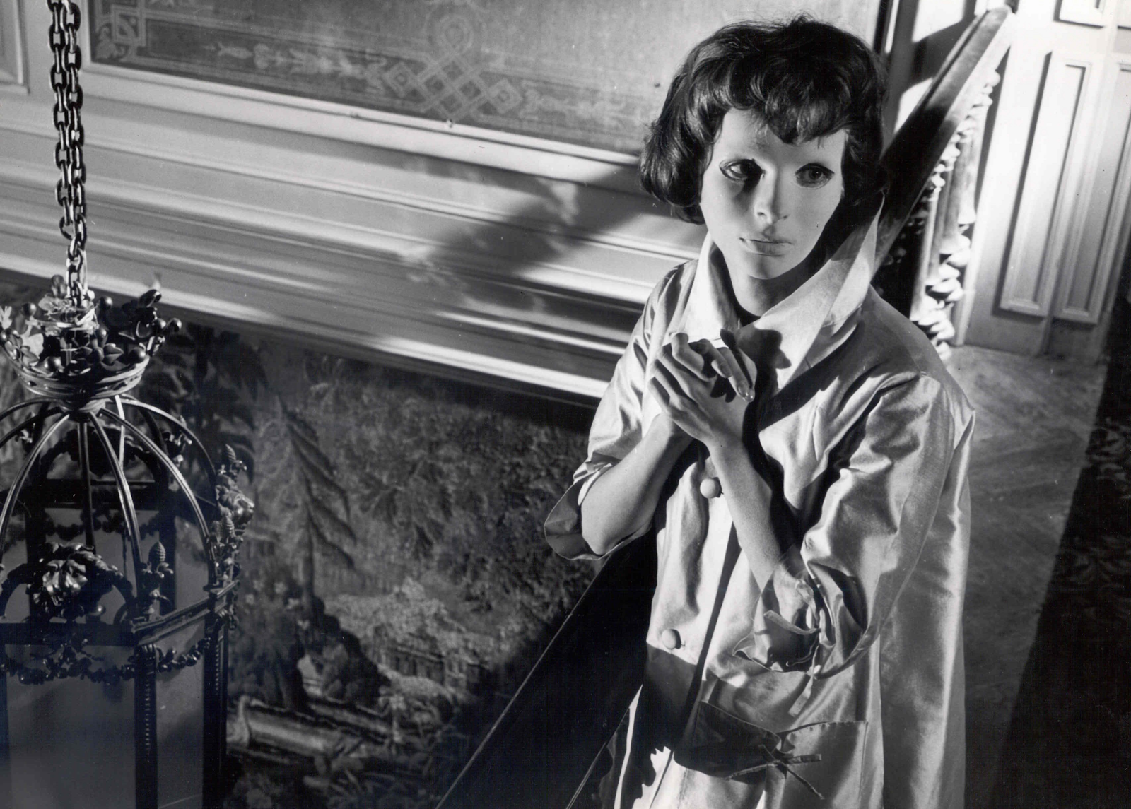
Eyes Without a Face – Georges Franju. (1960)
Eyes Without a Face is considered one of if not the best French horror films of all time, with exceptionally high ratings.
“Like a nightmare that never ends, this is a vision of madness, loneliness and, yes, horror that, once seen, demands to be viewed over and over again. It is that haunting, and that good.” – Turan, Kenneth. (2003)
Due to it being monochromatic in colour, lighting is used to replenish what colour subtracts from the film. There is a considerable manipulation of equally terrifying and astounding light throughout this film, but the most prominent being with Christiane’s mask.
A state of consistency isn’t particularly evident between these two works, though an alikeness can be interpreted through light or shadow in key sectors, in these cases the character. The way in which light is implemented creates a ‘spotlight’ effect, performed exceptionally within Eyes Without a Face when paired with uplighting to morph Christiane’s face into an uncanny view.
In contrast to these attributes, differentiation is visual within the amalgamation of lighting and colour. Lighting within L’apparition strictly portrays spotlighting, contradictory to Eyes Without a Face, which instils an unnerving feeling within its audience with well-distinguished depth, while also using this in developing compromise to the absence of colour.
I have ascertained a further understanding of the impact lighting possesses, and how it can work in harmony with colour to signify particular emotional impressions on the audience.
Amid the bounds of art theory, perspective possesses the meaning of effectively relaying depth, or further, constructing a three-dimensional illusion within a two-dimensional environment.

School of Athens – Raffaello Sanzio. (1508-1511)
A prime exponent amongst the annals of Linear Art, and also being considered Raphael’s magnum opus, School of Athens utilises perspective in an scarcely seen way for its time. Being one of few at the time who had remarkable understanding of oblique projection, Raphael employs this technique amongst handling of a central vanishing point to vividly illustrate the depth of the Ancient Greek architecture he visualised.

Elite – Acornsoft. BBC Micro. (1984)
“Elite combines the elements of a number of classical games to produce a superb three dimensional graphical trading game of skill and absolute addiction, that squeezes every ounce of performance out of the Beeb” – Fell, David. (1984)
Emerging both unanticipated and effortlessly, 3D environments in games would be affected forever by this release. As stated above, Elite illustrates a three-dimensional perspective in a way which was scarcely seen within the games industry at the time.This, paired with the game’s basis of a singular vanishing point, is particularly effective in the reinforcement of navigating an ‘endless’ three-dimensional environment to the player.
In the sense of resemblance, both works were heavily innovative pieces for their time, and gathered a new communal outlook toward linear perspective. This impact evolved from the central vanishing point; the orthogonal lines reaching to illusory distance and depth, whilst in a two-dimensional domain. In harmony to this, aforementioned orthogonals are further utilised to place the observer’s eye to the foreground, midground and background of these images independently, despite standing interlaced with one another on a flat plane.
Divergent to the above, I deem that the artist’s implicit delineation on the vanishing point for focality, lay separately from one another. This is notable within the space surrounding the focal points. In School of Athens, the orthogonals form an extensive effect, panning out from the centrepiece in this particular fresco. Whereas in Elite, a funnel-like effect is formed to imply the perceptive form of scouring deeper inward to space.
Following this segment, I have established the forms perspective can withhold and its capability of engrossing the observers, guiding the narration of story.
Within the constraints of the artspace, the decision of placement for each element in a piece is called composition.
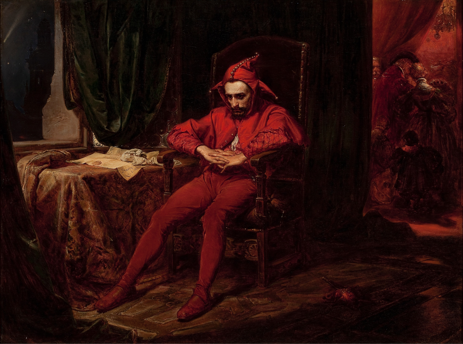
Stańczyk – Jan Matejko. (1862)
Stańczyk, a poignant piece of Polish artwork, exploits composition in such a facile way which evokes overlooked sympathy upon the archetype of The Fool, and its hidden alliance with conformity. The Rule of Thirds assists the conveyance of this, drawing the focal point towards Stańczyk as the heart of the piece, whilst equally declaring the significance of the lesser centred thirds. Jan Matejko particularly implemented this to form a distinctive barrier between the mood of Stańczyk himself and the simultaneous celebration playing out.

Isle of Dogs – Wes Anderson. (2018)
“As his career has progressed he has used Planimetric Composition with greater precision and for a larger portion of his films. In addition to the background being a flat plane, characters usually occupy and move through flat planes within the scene that run parallel to the background.” – Flight, Thomas. (2020)
Planimetric composition grasps the concept of perspective in art, and entirely upends it. This compositional technique places the camera perpendicular to the scene, and further, limits movement in these same ways. Subsequently, this establishes the impression of a two-dimensional environment, despite being three-dimensional.
Composition is a factor which almost always follows a sited praxis, and in consequence, there will be a predetermined relationship between many two pieces. In this case, the preceding statement is evident within the Rule of Thirds. Each work uses this rule to harness its primary recognition to observers.
Conversely, disjunctive elements can also be perceived, more so within the confines of premeditated sway of interpretation. Whilst Jan Matejko’s choice of composition leaned further toward sentimentality and emotional influence, Wes Anderson’s usage of planimetric composition and symmetry is an indication of directional substance and artistic choice.
Ensuing this investigation, I shall begin to meditate composition and the prospective result on a scene’s layers based on how it is exploited.
With each instalment of Art Theory in Context, perceptive traits can be altered in an influential manner to pivot the originative ideology of Art Theory. Postliminary to this study, I have instigated a tacit understanding of the intricacies within each segment of a piece, and the deviation from the fundamentals it can provide.
“The role of the artist is to find a way to articulate that, so I’m different from Danto in that I’m not trying to define art, I’m just trying to find a patent or a heuristic or an approach to how you would go about trying to appreciate or understand art. And to do that you don’t need a definition the way he expects you merely need a kind of procedural, a way of approaching art, and for that you can think of the artwork as a relationship between a purpose and a mode in which the purpose is implemented.” – Carroll, Noël. (2020)
This statement directly provides an insight into the ideology of Art Theory, and that art is not only for those who create but further those who consume. Therefore, each segment of Art Theory in Context implements momentous influence on viewpoints, in art ranging from fine art to film, from the creator’s intention to the audience’s interpretation.
The Death Of Germanicus, Official Gallery
The Death of Germanicus, Nicolas Poussin | Mia
Poussin, Nicholas. (1627). The Death Of Germanicus. Located: Minnesota, Minneapolis Institute of Art.
LSD: Dream Emulator
https://en.wikipedia.org/wiki/LSD:_Dream_Emulator
Sato, Osamu. (1998). LSD: Dream Emulator. PS1. Tokyo, Asmik Ace Entertainment.
LSD Dream Emulator Video – Quoted
Why You Should Play LSD: Dream Emulator
Person, Chris. (2012). Why You Should Play LSD: Dream Emulator. New York: Kotaku.
Quotes from Against Interpretation and Other Essays – Quoted
Against Interpretation and Other Essays Quotes by Susan Sontag
Against Interpretation and Other Essays
Sontag, Susan. (2009). Against Interpretation and Other Essays. London: Penguin Classics.
Guitar, Official Gallery – Quoted
Pablo Picasso. Guitar. Paris, January–February 1914 | MoMA.
Picasso, Pablo. (1914). Guitar. Located: New York, The Museum of Modern Art.
Guitar, MoMA Highlights – Quoted
D. Lowry, Chris. (1999). MoMA Highlights: 350 Works from The Museum of Modern Art, New York. New York: The Museum of Modern Art.
The Crimson Permanent Assurance
The Crimson Permanent Assurance (Short 1983) – IMDb
Gillam, Terry. (1983). The Crimson Permanent Assurance. Universal Pictures.
The Crimson Permanent Assurance, Critic Review – Quoted
This Week In Cinema: July 07-13, 2013 | Bill’s Movie Emporium
Thompson, Bill. (2013). This Week In Cinema: July 07-13, 2013. Wisconsin: Bill’s Movie Emporium.
L’apparition, Official Gallery
The Apparition | Harvard Art Museums
Moreau, Gustave. (1876). L’Apparition. Located: Paris, Louvre Museum.
Eyes Without a Face
Eyes Without a Face (1960) – IMDb
Franju, Georges. (1960). Yeux Sans Visage. Compagnie Cinématographique de France.
Eyes Without a Face, Critic Reviews – Quoted
Ravishing ‘Eyes’ returns in all its haunting horror – Los Angeles Times
Turan, Kenneth. (2003). Ravishing ‘Eyes’ returns in all its haunting horror. Los Angeles: Los Angeles Times.
School of Athens, Official Gallery
Sanzio, Raffaello. (1508-1511). School of Athens. Located: Vatican City, Apostolic Palace.
Elite
Braben, David. (1984). Elite. BBC Micro. Cambridge: Acornsoft.
Elite, Beebug Magazine Review – Quoted
elite – an outstanding new game from acornsoft
Fell, David. (1984). Elite – An Outstanding New Game From Acornsoft. Cambridge: Acorn Computers.
Stańczyk
Stańczyk by Jan Matejko | Obelisk Art History
Matejko, Jan. (1862). Stańczyk. Located: Warsaw, The National Museum.
Isle of Dogs
Anderson, Wes. (2018). Isle of Dogs. Searchlight Pictures.
Wes Anderson Filmmaking Video – Quoted
Why Do Wes Anderson Movies Look Like That?
Flight, Thomas. (2020). Why Do Wes Anderson Movies Look Like That?
Interview with Noël Carroll – Quoted
Noël Carroll On Art Appreciation – Part 1Carroll, Noël. (2020). Noël Carroll On Art Appreciation – Part 1.
Abby Galloway
On the week of the 20th November to the 24th, we were introduced to our first school GameJam, the NexGen November 2023 GameJam. We had a week to complete the brief given, in teams of 4 or 5, competing against each other as well as other schools across the UK. On top of this, it is also included as work experience and we receive feedback from industry workers themselves, and in this case, we received feedback from Angie Engelbert from Blizzard Entertainment.
We received our brief, set up our original concepts and both a Miro and Trello board, including planning for the week ahead. After this, we made a mood board on our ideas and began conceptualising with basic sketches.
I made my personal concept sketch, we further advanced our concept sketches within more detail, and began 3D modelling. During this time, I was also project manager, hence my general workflow being slower than my teammates. This day we also received feedback from Angie Engelbert from Blizzard Entertainment, which was incredibly helpful, as we were informed what was missing from our project which was that it lacked meaning and backstory, so I then included it on the Miro board.
This day was mainly based on 3D modelling, finishing 2/3 of the ship models. On this day I personally mainly focused on the Miro board, organisation and ensuring we would have the product ready in time (Thursday) and didn’t get much else done. This was not the most productive of days, and if I could go back I would have done further modelling for my personal model as it didn’t end up completed in time.
On this day, we had until 4pm to finish our hero shot and present. Unfortunately, I was absent on this day, though I still worked from home to get the product out and make sure my team was managing their time correctly. Using a lot of online contact, I ensured my team had their models fully textured and sent to me so I could arrange them for a hero shot. I then decided to prioritise the general product and updated the Miro board into a way which could be used for presentation, pushing my model aside and excluding it from the final product. This was not ideal, but I believe the final product was still of good quality for the time we had.
Overlooking the past week, I am so glad I had this opportunity and learned a lot from it. Particularly in terms of workflow and project management, something I would have previously never seen myself doing. In positive aspects, I am grateful for the experience I gained from this and the product that was presented at the end of the time period. However, I believe I could’ve managed time slightly better to complete my model in time, and have been present during the presentation period as I did not end up being able to present.
Abby Galloway
On track for the deadline and with the main art/animation out of the way, I had to begin with the functions. The game is incredibly simple, only holding a really small number of functions such as jumping, walking, wall jumps and collecting. These were all simple to program within Construct, the biggest challenge being posed with the wall jump to work within gravitational and speed values. This is how I ended up implementing this feature:

This worked well, though was not perfect, as I could not correctly monitor the speed you ascend. This didn’t pose much problem though, as it made no difference to the game. In terms of the orbs, I didn’t have enough time to create a more advanced puzzle system, but I made it so that each coloured orb (only two in this instance) obtained a unique numerical value, and at the end if the addition of the two values creates the correct numerical value, a blue orb appears. This is the program structure for that:

(Note: I missed the naming conventions as I completed all these segments at once, and the game was finished after these were added. I should’ve added them nonetheless, and will be taken further into account next time.)
Once this was completed, my game was finished! It was overall not amazing, lacked a lot of substance and there are a lot of things I would’ve done differently, though I am still happy with getting a functioning product out in time. I would like to note the main things I would’ve changed, mainly within the area of time management. I would have dedicated less time towards the artistic aspect of the game, simplifying it and devoting more time towards functional value and more advanced puzzles. Following this reflection, here is a link to the finished product so you can see for yourself!
Abby Galloway
Following the completion of my character with a simple animation, I had to progress into map development to ensure a product on the deadline. To begin this process, I constructed a mood board following Laboratory designs, as the setting correlates to the story. I was particularly influenced by the game Bunker, another pixel art based game with an amazing appearance. Here is how my mood board turned out:

Following this, I briefly looked into the ideal layout for tile maps as it would greatly reduce time taken and workload, making it much easier to meet the deadline. This taught me an efficient way to produce simple map designs while making it flow correctly when placed. Here is my tile map:

This turned out better than I had expected whilst still following through the colour palette established within the brief, though I ran into a few problems along the way. One of these problems entailed making adjustments to the ways certain corners joined segments of the map together when being placed, and overlayering within the background tiles. Though this was easily fixable without consuming too much time, except for the background, which was left with small error, and after placing the tile map into a level form it looked like this:
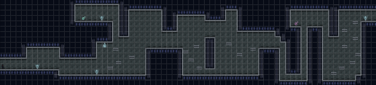
With this and addition of the platforms, guidance markers and orbs for the puzzle, my map development was complete and I had to move toward game mechanics next. Looking back, despite being happy with the product, I definitely should’ve fixed the background error and if I’d had the time, added another level with a different design.
Abby Galloway
After creating a one pager, my next chosen step was to design my character. However, I did create a quick original concept for my one pager. I stuck to the blue colour scheme and used the reference of a motorcycle helmet on the head, utilising the idea of a visor. This is how that looked:

Once my one pager was finished, I wanted to recreate the design in a 64 x 64 pixel canvas for extra detail, instead of the previous 32 x 32 canvas. To begin this process, I compiled an inspiration board of reference images I could later use to create my character’s final design.

I originally planned on a more detailed, robotic suit but decided to keep it simple whilst using the two pixel art pieces on the bottom left for reference. In terms of weaponry, I didn’t end up adding one, which I now regret and would’ve done differently. This was my final 64 x 64 design of Evan, taken from the game itself.

Here, my final design was complete. All that was left was my animation. I decided to get the most important animation out the way, walking. I also had planned on creating an idle/jump animation, though as my project panned out it was not a top priority and I never got around to it. I followed online resources to locate the sprites I would need to create an accurate walking animation. This is the guide I followed, though I added an extra sprite to ensure the angle was accurate as the original angle of the character does not correlate with the walking direction.
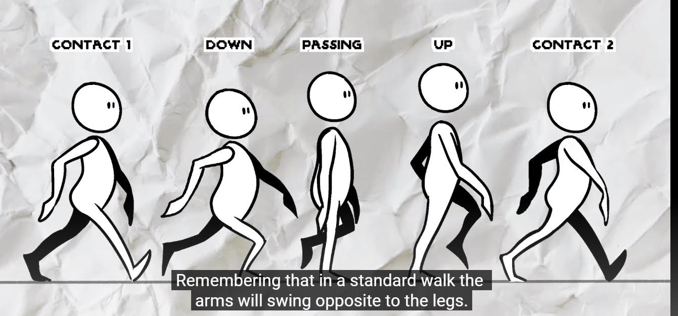
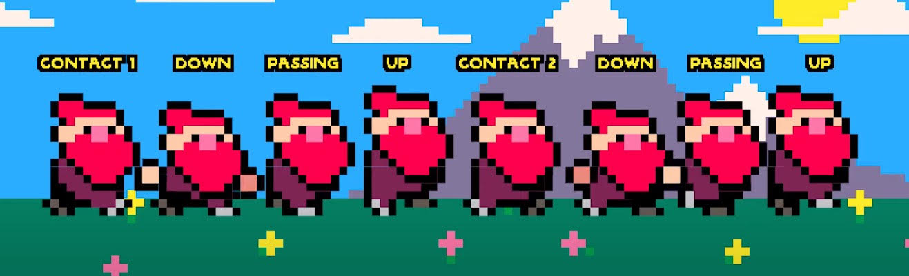
Source: Easy Pixel Art Walk Cycle Tutorial
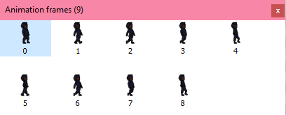
Utilising this guide, I created the correlating set of sprites and then added them into the Construct animation page, and ensured the timing of the animation made a clear visual of walking. This is a visual representation of that process, and the finished animation can be seen within the finished product.
Abby Galloway
In preparation for my Art Theory In Context essay, we studied the main sectors that make up art theory to get a better understanding of these concepts. Another thing we did in preparation for the essay was write up our understanding of composition within different examples to see the areas we need to improve on in our writing, before the essay is submitted. Here are my examples in this compositional task, these examples taken from Fine Art and film.
Stańczyk by Jan Matejko, 1862
Image from: https://en.wikipedia.org/wiki/Sta%C5%84czyk_(painting)
Composition is used in this piece mainly through the Rule of Thirds. This is used to draw attention to the centre of the screen; where the fool is sat. It also uses this together with vertical lines to draw attention to the background. Vertical lines are used in this case to show separation between the fool and the other people in the painting. This is done by the artist to convey the story that the painting is trying to tell, showing the main focus of the painting being the fool himself, but that the gathering in the background is also relevant to the story.
The Grand Budapest Hotel, Wes Anderson, 2014
The Rule Of Thirds is commonly used in not only The Grand Budapest Hotel; but also in the majority of Wes Anderson movies. Wes Anderson directs his movies in a way which they always have a satisfying feel; mainly by using the Rule Of Thirds, specifically in this movie. He does this by always keeping the focal point clear, mostly in the front or mid centre of scenes, whilst using minor objects on the sidelines to also gather attention for the eyes to meet. This paired with the colouring schemes of the scenes make the focal point even more understandable. Another strong feature within his movies is his scenes tend to be one longer shot at the same position/angle, meaning it gives time for the audience to take in the whole scene.
Furthermore, another strong compositional technique used in this scene specifically is symmetry. Symmetry is used in this shot even when unnecessary to make easy on the eyes; to retain the audience’s focus whilst the character included in the scene speaks. In movies by Wes Anderson (including this one), a lot of the speech and overall story being told can be quite difficult to understand and take in, making the composition of these scenes an incredibly smart decision by the director to ensure the audience is able to retain the information in an easier way, by putting less strain on the eyes.
Other sources used: https://papierhuis.com/2017/06/23/movie-madness-the-grand-budapest-hotel/
Abby Galloway
After being given a simple brief: “blue”, the first thing to do was come up with a final concept. The process to this involved originally listing as many things as possible associated with the word blue that could be further developed. Here is an example of some original concept ideas formed from the word blue:

I then developed these concepts into further ideas, before going through and eliminating them into which idea I wanted to put all my time into and construct a game from. This is how it turned out.
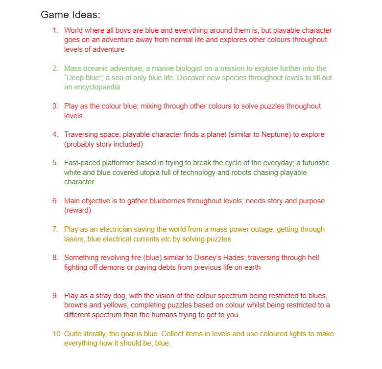
The colours used throughout the elimination process represent my opinions of them. Red being a cancelled idea, lighter green being a possible idea, and the darker green being the idea I ended up selecting. The two yellow concepts, however, were both to be used cohesively in addition to the final idea, to add extra depth and purpose to my game.
So there I had my game idea: A fast-paced platformer in a utopian reality, where you play as an electrician whilst solving puzzles and being chased by robots. My next task was to develop this idea into a short but detailed explanation, by making a one pager. To do this, I created basic concept sprites (will be mentioned in later posts) as well as developing some story for the game, to create a goal and give the player a ‘reward’.
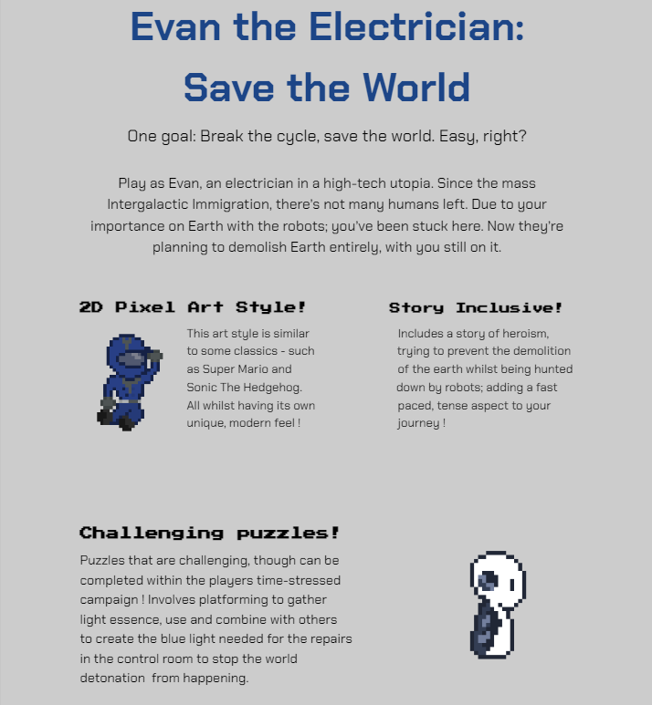
This is how it turned out, and with this it gains a further understanding on how I have developed a concept into a full idea, the process in which that took and my personal interpretation of the brief.
Student: Abby Galloway
Platform: Steam, Xbox (One, X, S), Playstation(4, 5)
You’re lost in an abandoned castle in a frozen wasteland with your partner, except you’re not in the same part of the castle, all you have is a walkie-talkie on either end.
Work together to solve puzzles to escape the castle and find each other again.
Set in the Antarctic, in a castle called Castle Rock. The game’s art style uses a range of cool toned colors and manages to create an eerie, unsettling atmosphere despite not being any strain graphically, and keeping things relatively simple, to create a subtle environment whilst keeping the focus of puzzle solving. It manages to also make good use of light and dark evenly to create tension and immersion on top of its sense of entertainment.
Core mechanics: Puzzle solving, communication
Non core mechanics: Certain interactive objects obtain no purpose
Communication.
Teamwork
Escaping the castle
Communication
Target Audience:
We were here (now a franchise) started as a student project by a group of 15 students studying games and design in Rotterdam University of Applied Sciences, The Netherlands. It was inspired by and seemingly for the players of games such as Myst, Amnesia and even real-life escape rooms. but at the time one thing those games were missing or certainly lacking on was a co-op experience, which is what makes We Were Here such an entertaining experience.
Review the game:
We Were Here is an incredibly immersive co-op experience, a masterpiece of a co-op game considering it was made in only 14 weeks. It brings fun while challenging puzzles that require some equally funny and frustrating communication between both players. Another great piece to this game is that it includes multiple solutions and endings, meaning it has great replayability. Despite the game always being funny, it has its fair share of eeriness, constructed by the atmosphere and soundtrack throughout.
However, the game (debatably) has its negatives, though all minor, in things such as problems and bugs in the communication aspect of the game (undoubtedly the most important part), and its short play length, resulting in many players wanting more; though this worked very well for the business as it became a franchise later on.
Overall, this game is a must-play, incredibly fun experience for friends (though it can be quite infuriating) and especially a great kick starter for the franchise as the only free-to-play game of the set, grabbing in its audience and acquiring their support in their newer, paid for games.
Overall rating: 9/10

https://en.wikipedia.org/wiki/We_Were_Here_(series)#We_Were_Here_(2017)

Student: Abby Galloway
Dead Island (1)
Platform:
Windows, PS3 & 4, Xbox 360 & One
Open World, Survival Horror, Shooter, RPG
Dead Island is a zombie apocalypse based survival horror game, where you play as one of four main characters; all trying to escape the island of Banoi, fighting zombies and completing quests along the way.
The objective of the game is to defeat the zombies, bosses and complete quests in efforts to escape the zombie infested island and reach safety.
The game is set in a fictional island named Banoi, set off the coast of Papua New Guinea, and the game took place in September of 2006. The art style of the game has a handful of tropicality and bright, contrasting colours to the theme of violence and death that takes place, making things such as blood stand out dramatically.
Core mechanics: melee combat, quests, story
Non- Core mechanics: skill trees, collectibles, trophies
Playable characters
Weapon collection/upgrading
First person combat
Dead Island’s primary audience was general film and TV fanatics of the time, as its initial release date in September 2011 was amidst the trend or craze revolving around Zombies of the early 2010’s. This was shown by the public’s reaction to shows such as The Walking Dead beginning to air a year prior to Dead Island’s release, World War Z on the brink of release around this time, and the highly praised ratings of the films 28 Days and 28 Weeks Later, within 10 years prior to release of Dead Island. Zombies seemed to be a trend at the time, and it seems the developer (Techland) though having previous experience within first person shooters, had not made a game revolving zombies prior to this, furthering the chances that its concept was planned around the trend in film/tv at the time, and not the companies personal audience.
Reference links:
https://www.theskinny.co.uk/film/opinion/28-days-later-20-years-later-zomie-films
https://en.wikipedia.org/wiki/List_of_Techland_video_games
Dead Island has its even share of both positives and negatives, ending in a lukewarm opinion from the general public. Though in my personal opinion, it is a very enjoyable game mainly with friends, but a good open world game to play nonetheless. However the developers follow up, almost perfectly rated title Dying Light definitely has its way of putting Dead Island down.
The main basis of the game is fun, well-paced and engaging whether in co-op or singleplayer, though a lot of quests throughout the game become repetitive and can be especially boring if you’re on your own. To add to the negatives throughout the game, the base game (and even Definitive Edition; despite its best efforts to fix this) includes a lot of bugs/glitches which can definitely irritate the player, possibly leading to a lower completion rate of the game as expected.
Though a widely positive aspect of the game is within the four main, playable characters. Each is unique and with their own stories, but the game has its own unique way to use the environment to make you feel like a part of your chosen character, feeling with them and fearing with them.
In personal experience, my first playthrough I only made it about 67% of the way through, before closing the game and not reopening it for a few months. This was due to bugs within the crafting menus, making quests even more difficult than they needed to be. However, when I eventually picked back up the game for a full playthrough, it was thoroughly enjoyable, and if you can get past its flaws, an overall great game.
In general terms, I’d say the game is around a 7/10; especially for its release date and after its remaster.
Though in terms of genre, there’s definitely better options out there, but it’s absolutely worth at least one playthrough.
Review reference links:


